Design System
Website Design
Web Responsive
ASEAN
From a single campaign slogan “Threads of Continuity, Fabric of Partnership” it evolved into a full-fledged digital exhibition site featuring time-travel storytelling, mini-games, and a hidden character hunt, inviting the public in ASEAN and Japan to celebrate two decades of partnership.
Role
Website Designer
Duration
1 Month
Year
2026
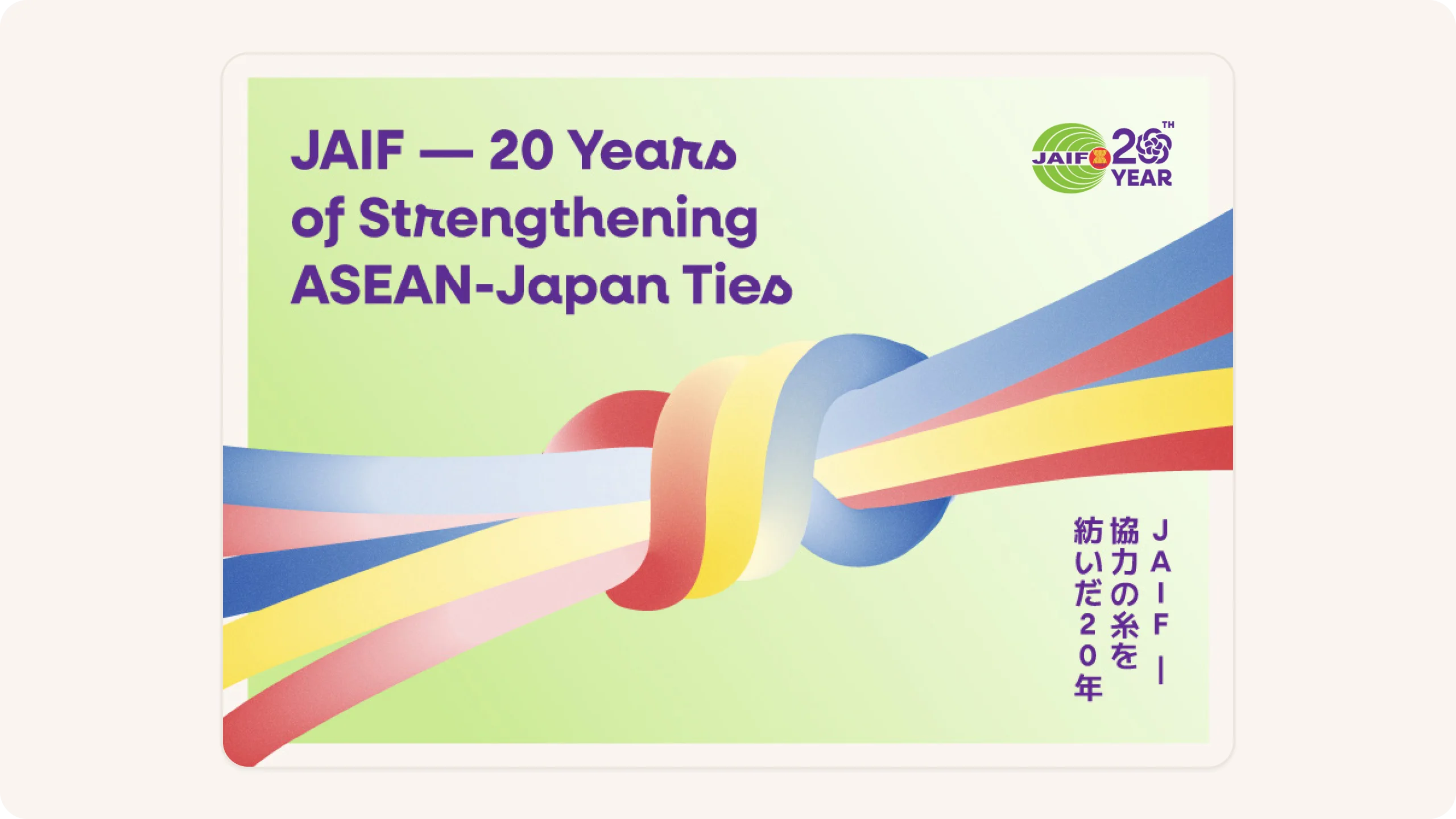
Overview
An anniversary campaign that gives people a reason to explore, not just read
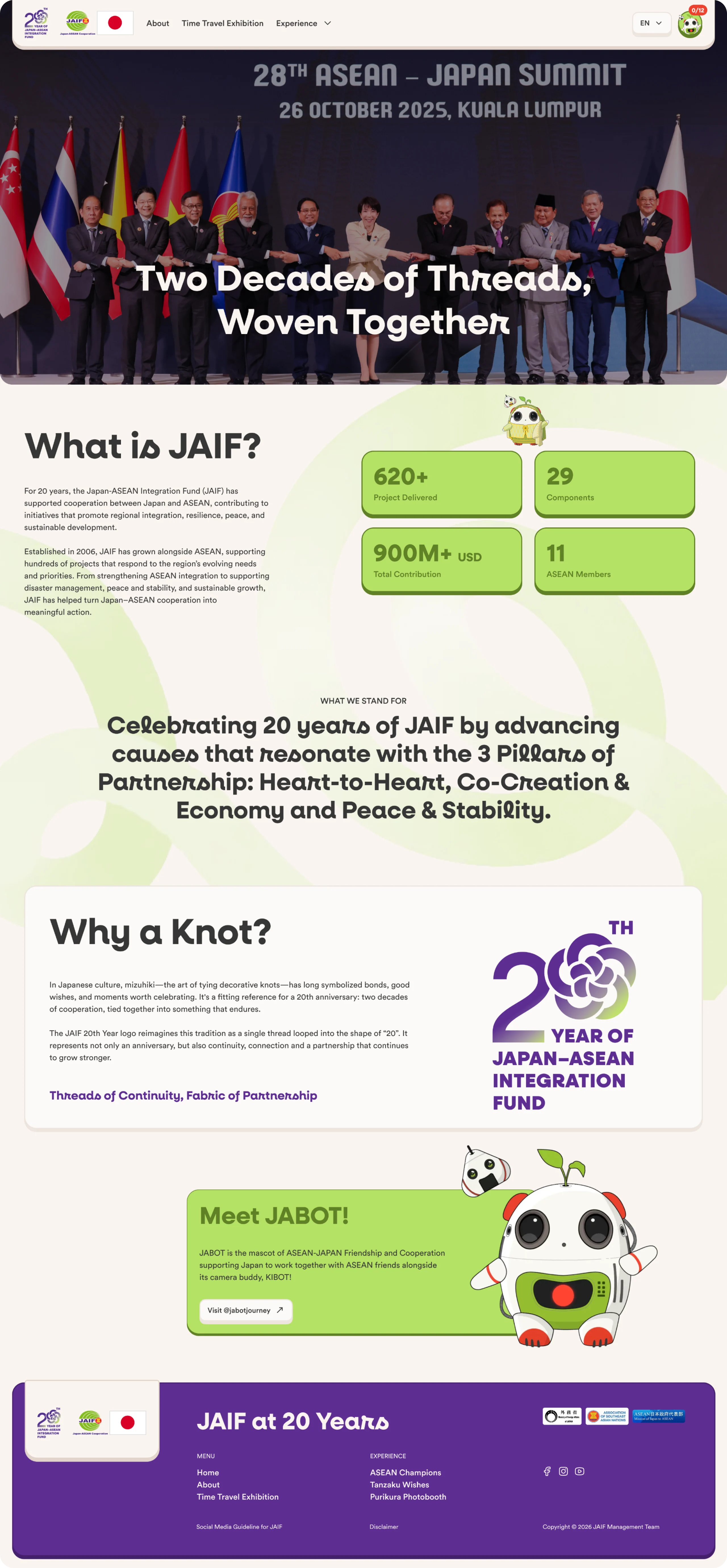
JAIF (Japan-ASEAN Integration Fund) was established in 2006 and has funded more than 620 projects worth over 900 million USD across 11 ASEAN countries ranging from disaster management and cultural exchange to regional stability. The year 2026 marks the 20th anniversary of this partnership, and JAIF aims to celebrate it not through an annual report, but through a digital experience accessible to the general public from government officials to the younger generations in ASEAN and Japan who may have never even heard of JAIF.
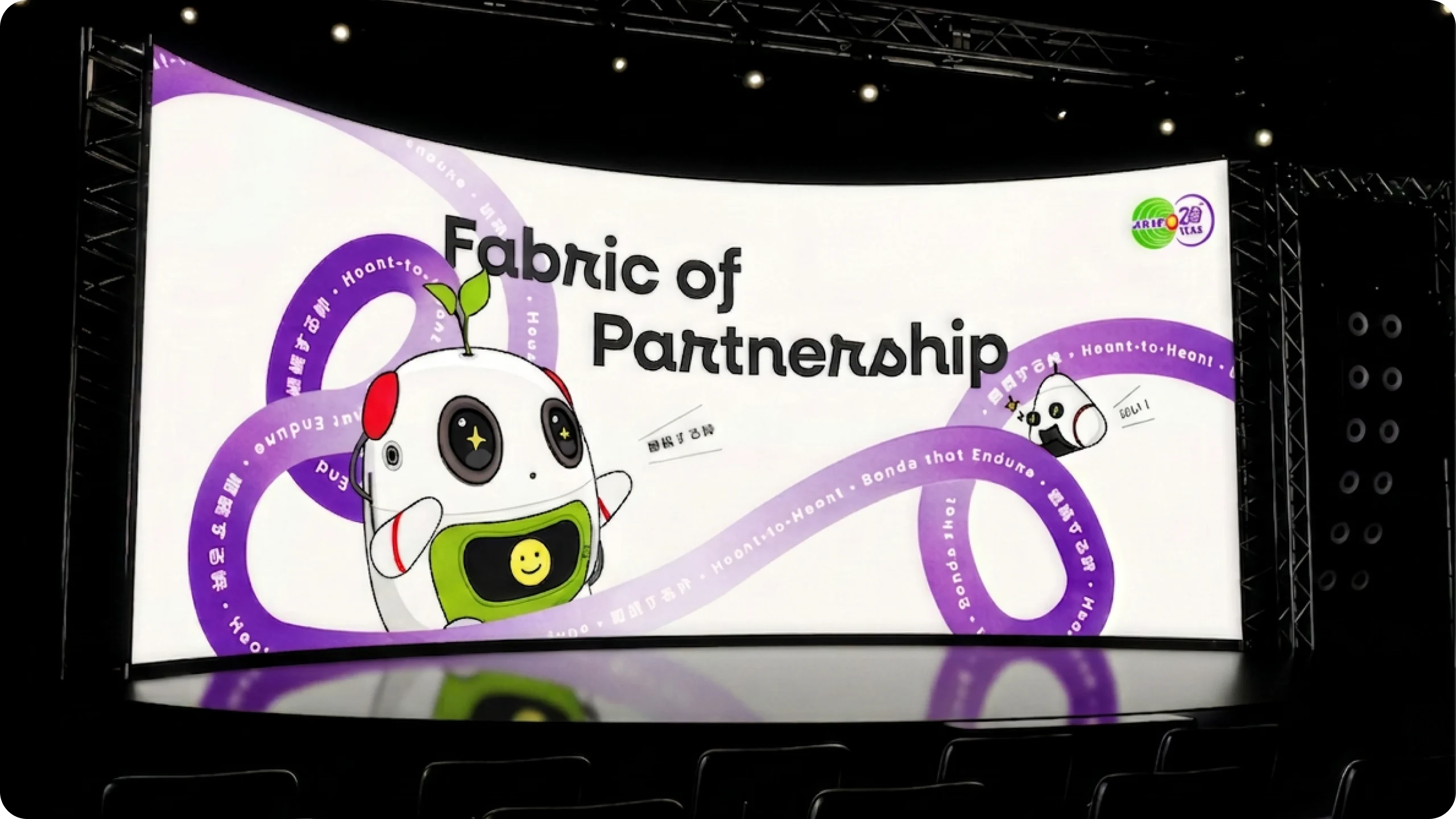
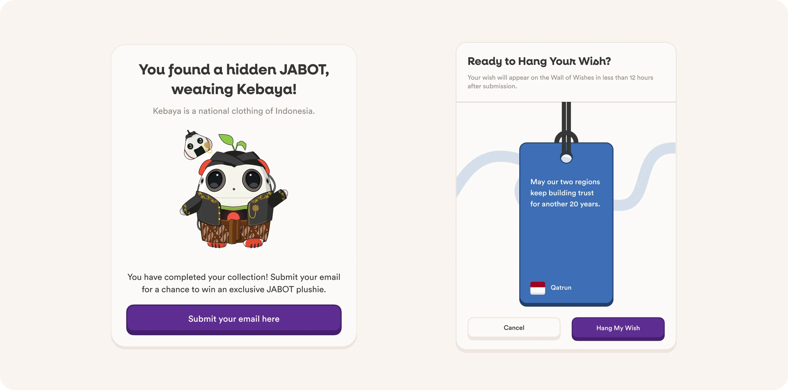
We were brought in to design a mechanism that would give visitors a reason to explore every corner of the site not just the landing page. The solution: the JABOT Collection, a hidden character hunt featuring the JABOT panda-robot mascot dressed in traditional attire from the 12 ASEAN countries plus Japan, hidden across various pages of the site.
Challange
The website still needs to address the basic questions of a company profile: What is JAIF? When was it founded? What has it accomplished? And why are these 20 years worth celebrating? The audience is broad ranging from government stakeholders to the general public in ASEAN and Japan so this information should not come across as overly simplified.
Celebrating JAIF’s 20th anniversary by highlighting issues relevant to the audience, reflecting the spirit of the ASEAN-Japan Joint Vision Statement, organized into the three pillars of the partnership:
Heart-to-Heart — Across Generations
Co-Creation — Economy & Society of the Future, Partner for Growth
Peace and Stability — Resilience & Security
A very broad audience. From the Government of Japan, the ASEAN Secretariat, and the governments of member states to the general public in ASEAN and Japan, and specifically the younger generation in both regions. This range means the site’s tone cannot be too formal (or it will lose the younger generation) but also cannot be too playful, lest it lose credibility in the eyes of stakeholders.
A strong but static visual concept. The theme “Threads of Continuity, Fabric of Partnership” is inspired by mizuhiki the Japanese art of tying decorative knots that symbolize bonds and good wishes. The JAIF 20th-anniversary logo is a reinterpretation of this knot shaped into the number “20.” The principle of thread → knot → weave is used as the visual language throughout all print materials and the brand deck.
Solution
The most fundamental decision in this project was to ensure that the site remains fully functional as a company profile all core information about JAIF and its 20-year history remains intact and complete but wrapped in an interactive layer so that people accessing it from home will enjoy exploring it, rather than immediately closing the tab after reading just one paragraph.
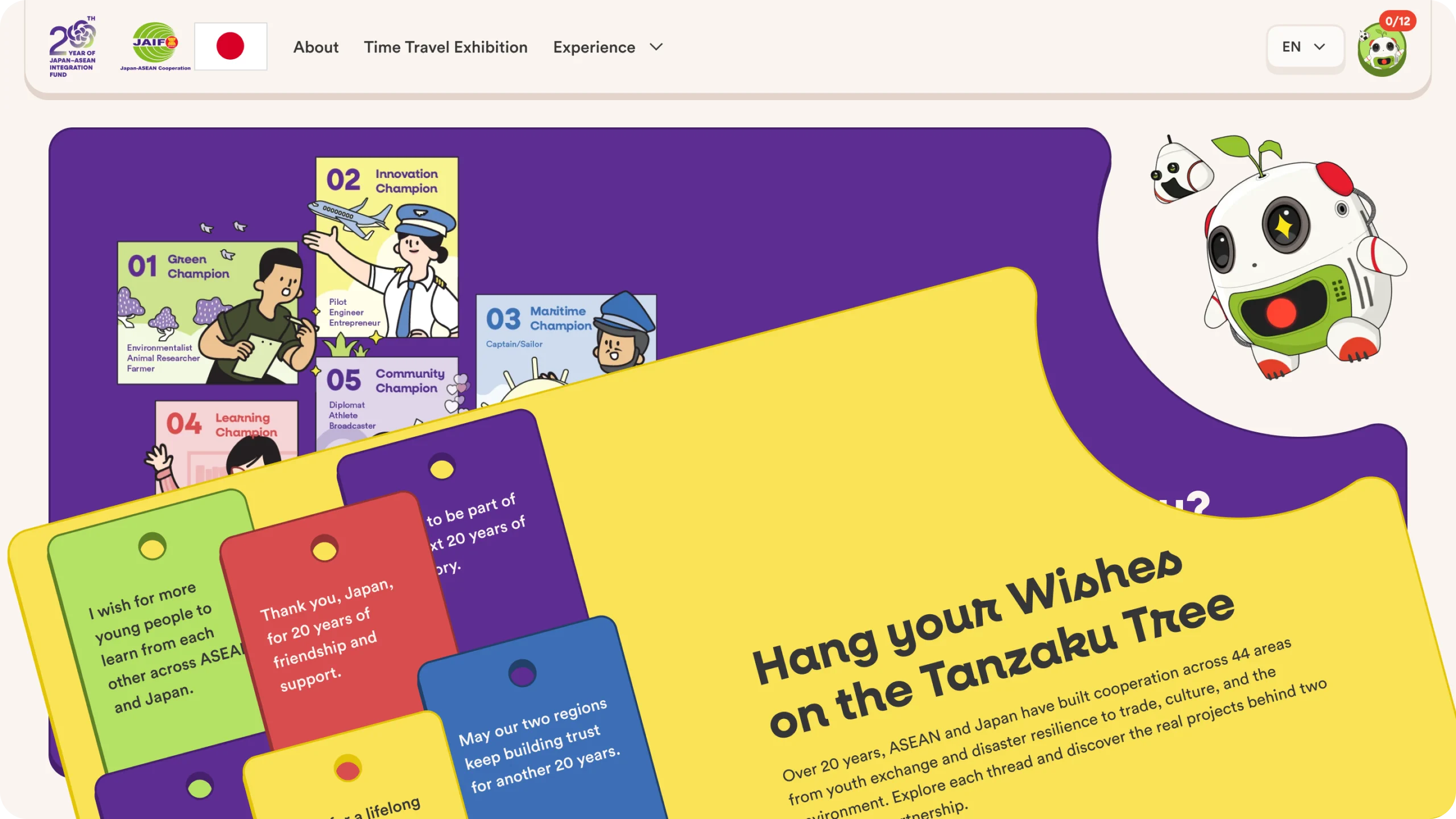
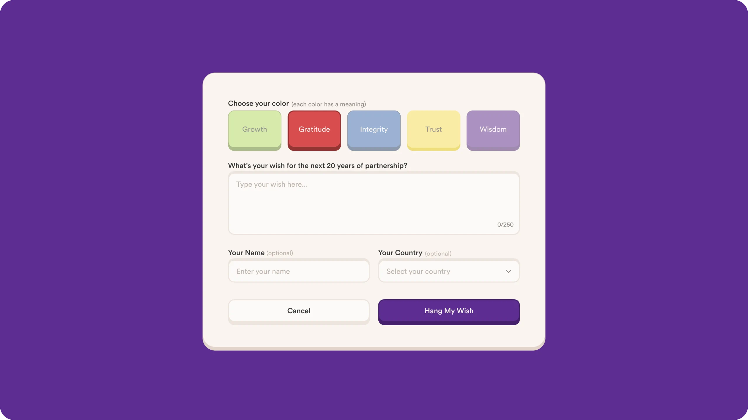
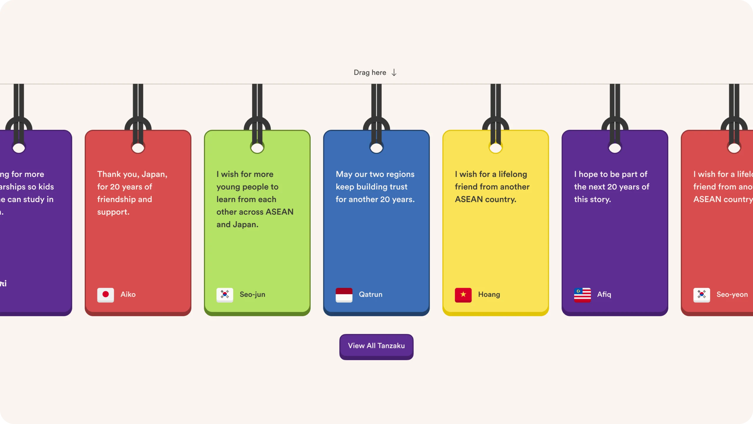
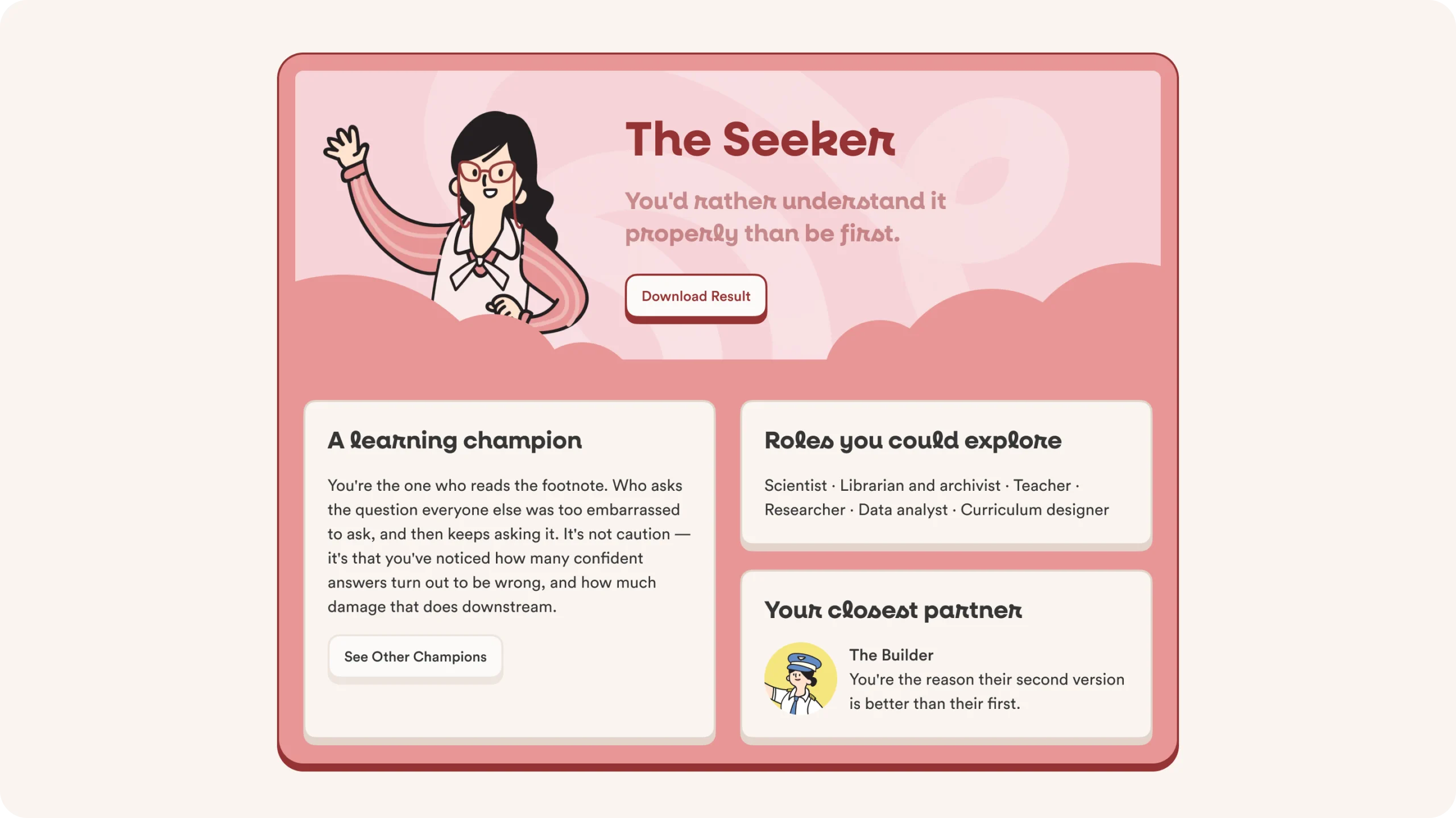
A JAIF-themed personality quiz, a digital “wall of hopes” in the style of tanzaku, a virtual photo booth, and a hunt for hidden mascot characters all of these serve as “little treats” interspersed among the informational content, encouraging visitors who initially just wanted to skim through to stick around longer and explore more pages.
A strong visual direction based on the concept of “thread → knot → weave,” inspired by mizuhiki, the Japanese art of tying decorative knots as symbols of good wishes. Our task was not to literally copy these elements onto the web, but to choose which ones needed to “move”:
The knot motif from the logo is translated into decorative curved lines that frame the hero section and separate different parts of the site creating a sense of flow rather than a rigid break at each section boundary
The JAIF 20th Year color palette (purple as the primary color, enriched with ASEAN colors) is divided by function: shades of purple for more institutional sections (About, History), and bright colors for playful mini-experiences
The campaign mascot, which in the initial brand deck was intended solely as an asset for printed merchandise (pins, plushies, stickers), has been given a new role as a guide for interactions throughout the site with the same element, but with an expanded function
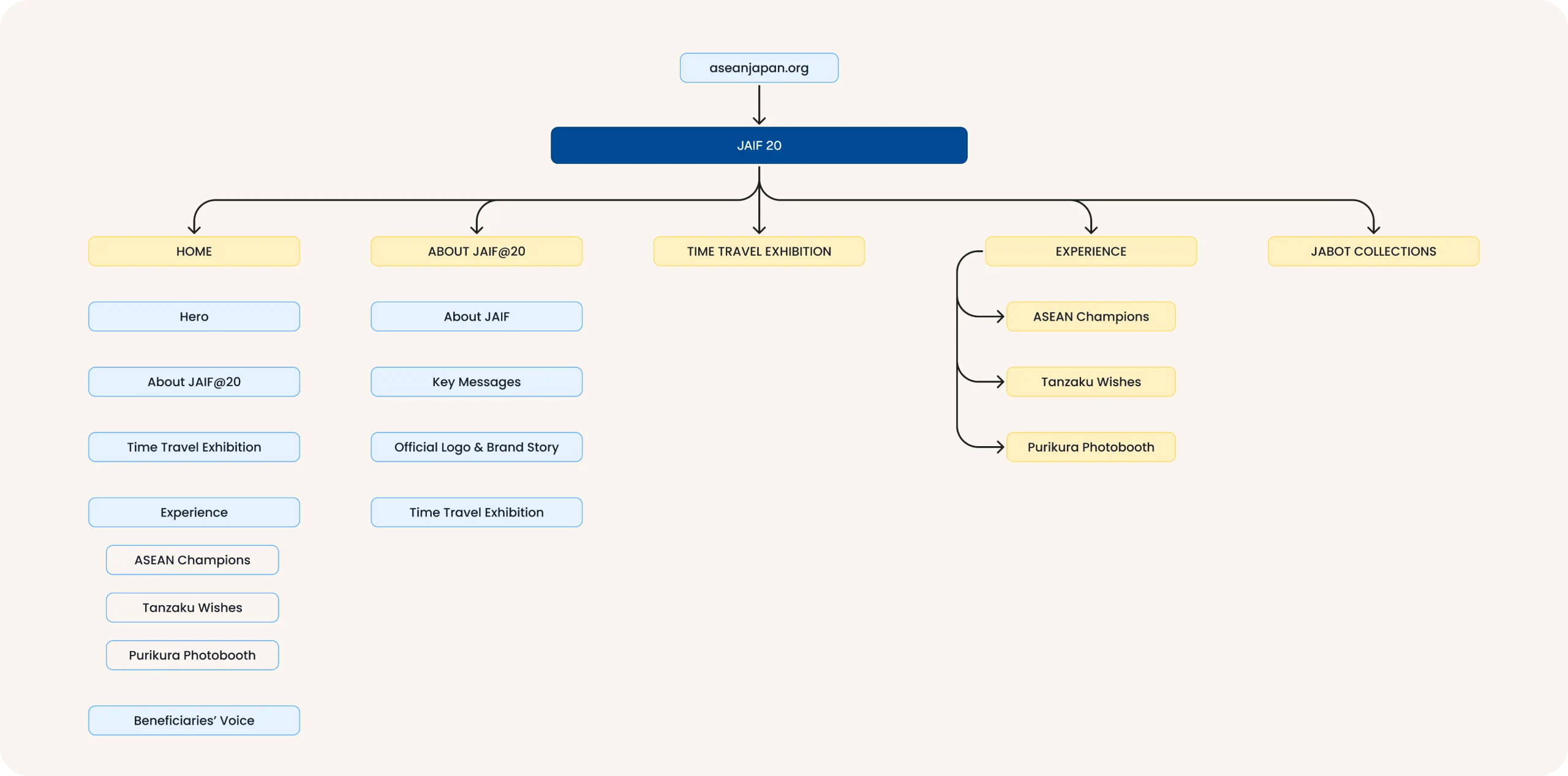
Information Architecture
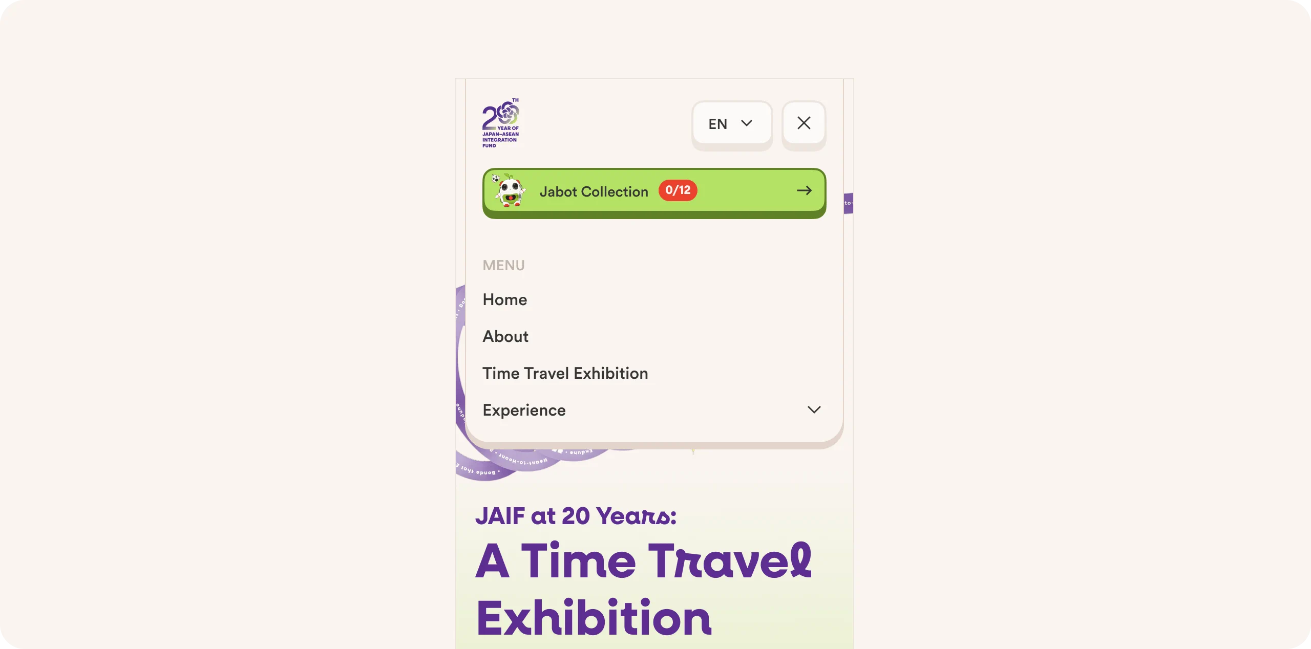
Before delving into the visual design, the site’s structure was organized to follow the logic of visitors arriving without any prior context who might be hearing the name JAIF for the first time. The main navigation is divided into four major sections:
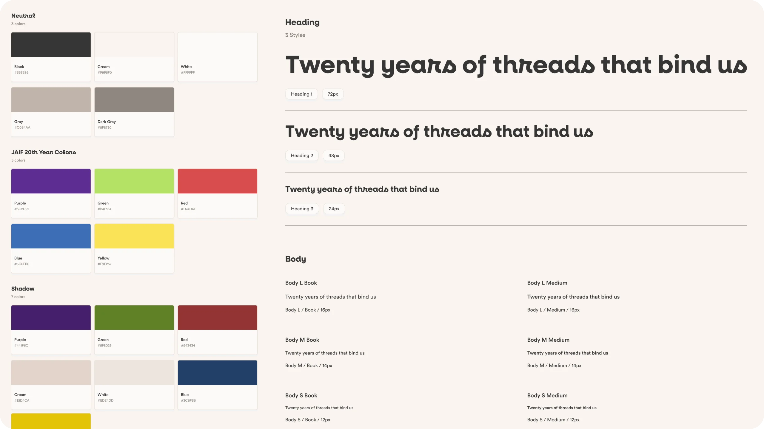
Design System
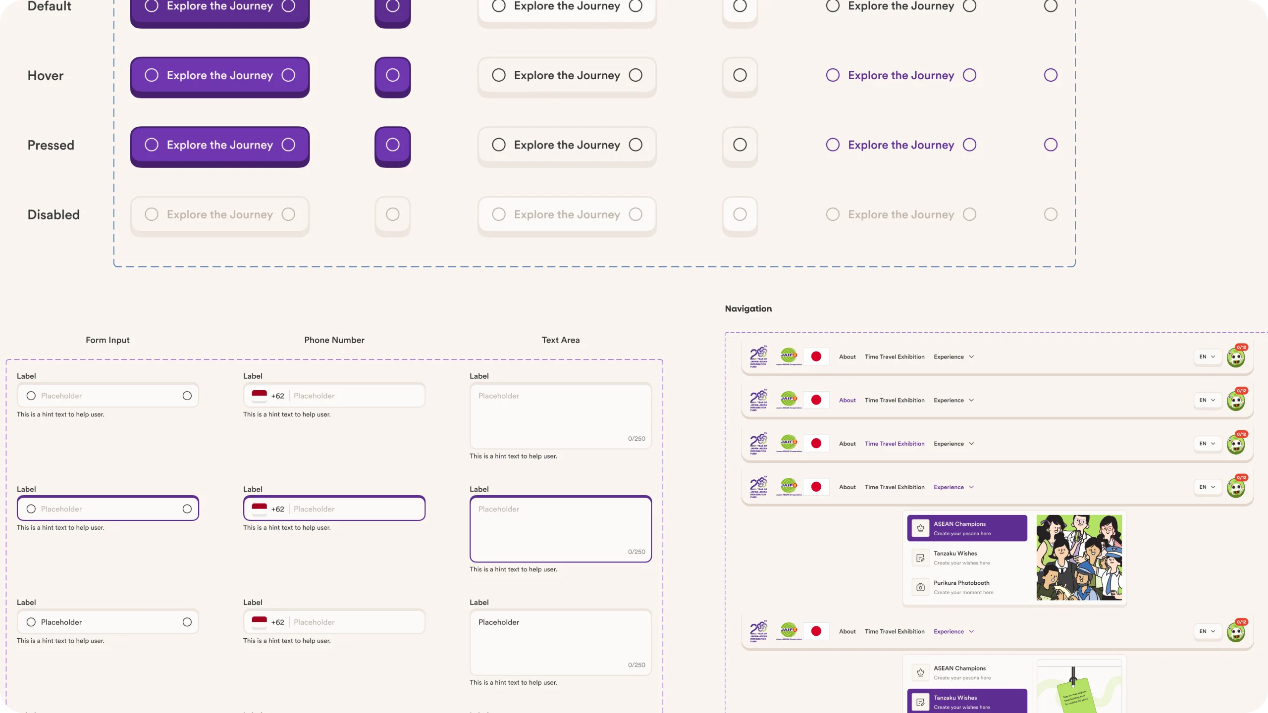
Before building pages one by one, all visual elements are first consolidated into a single, reusable design system—ensuring that colors, typography, and UI components aren’t “reinvented” every time a new page or feature is added.
Investing in this design system phase makes the process of building each subsequent page much faster—because visual decisions (such as what color to use for an error button or how large a heading should be on a new page) have already been settled from the start, rather than being decided anew every time a new requirement arises.
Visual Design
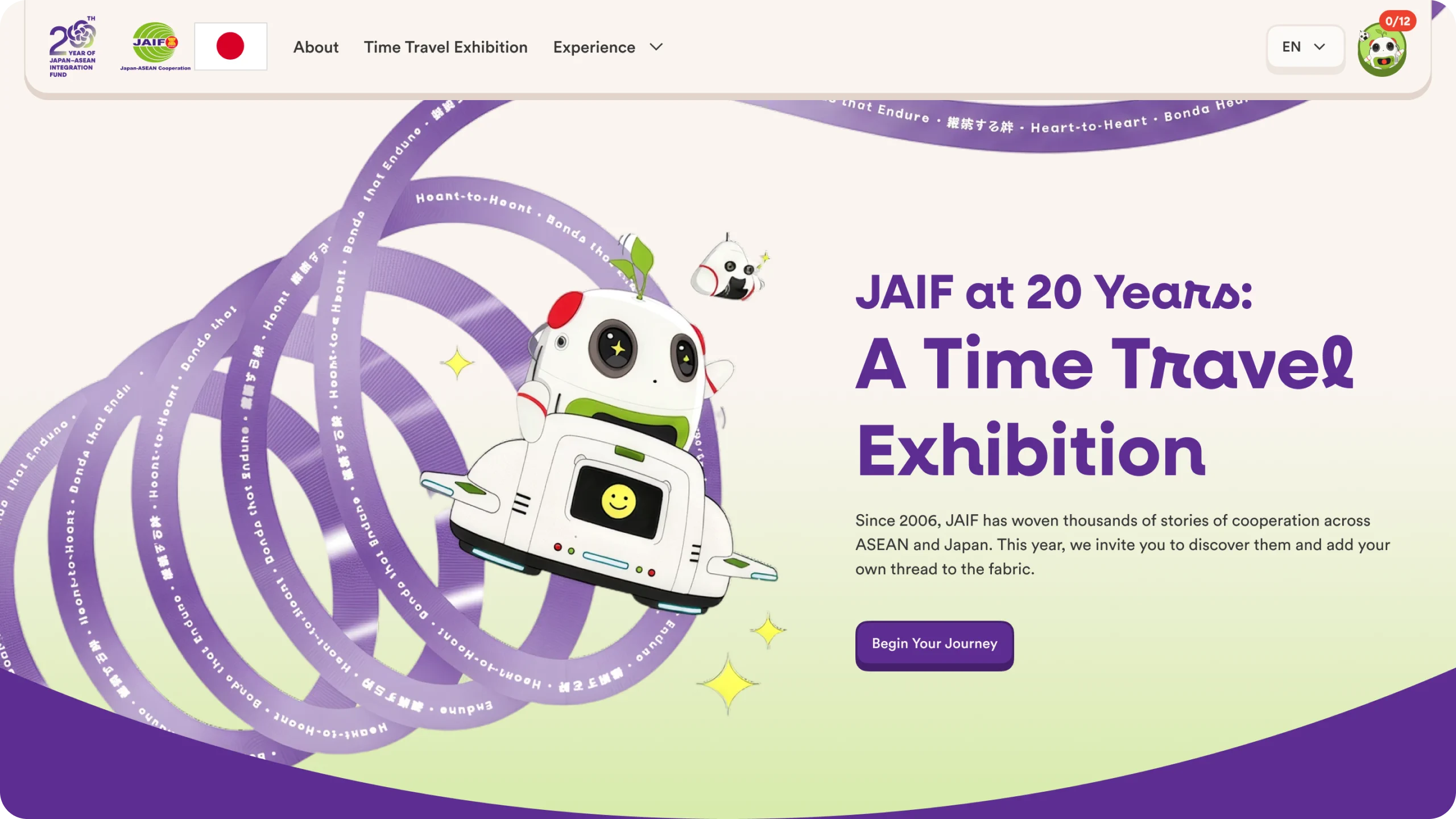
With the structure and visual system already established


Impact
95% of visitors who interacted with at least one interactive experience (Tanzaku, ASEAN Champions, Photobooth, or JABOT)
220 wishes written on the Tanzaku Wall
Reflection
The turning point for this project came when we stopped treating institutional content as “information that must be presented in full before we can have any fun,” and began treating both information and entertainment as a single. A comprehensive company profile makes the site credible; lighthearted features make people actually want to read it.